
MSG.com
Role: Director, Digital Product Design
For four years I led the charge on the UI/UX design front for msg.com, the main site for Madison Square Garden Arena and its sister venues The Theater at MSG, Radio City Music Hall, The Beacon Theatre and The Chicago Theatre.
Beginning as a solo design operation on the Digital Platforms team as Senior Manager of Digital Product Design, I rebuilt the now current iteration of the Figma design systems, leveraged and expanded existing modular designs, improved component libraries, created net-new visuals to enhance iconography and image scaling, introduced interaction states, and built templates for production uses both within my larger team and adjacent marketing operations. While expanding my team, I reset the design process to ensure visibility, collaboration and appropriate review sessions with the creative marketing leads, stakeholders and executives, and eventual handoff to the engineering team. I was awarded recognition in my efforts as Design Director and established a reliable, high-impact team that included a product designer/researcher and various design interns during summer sessions.
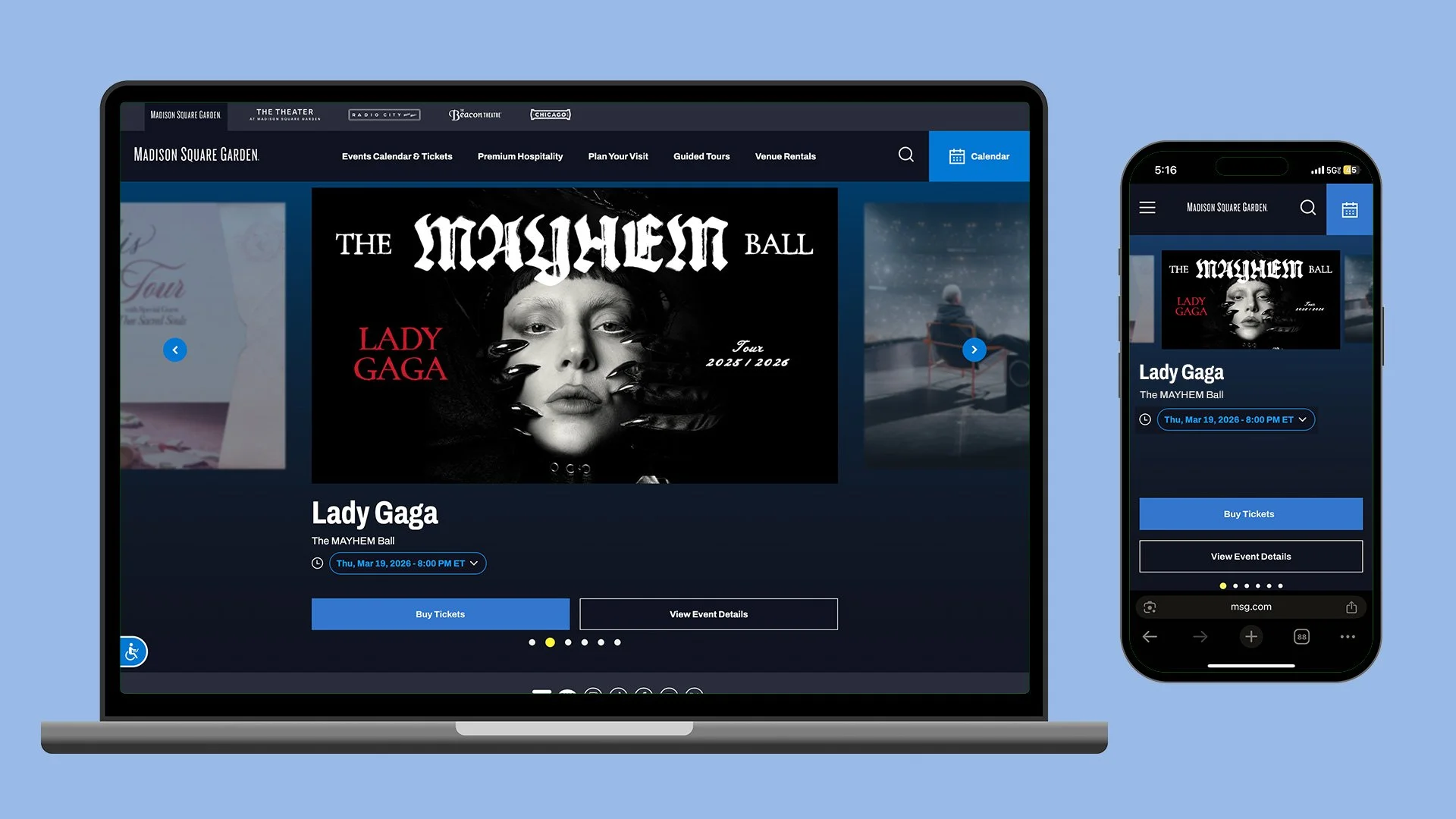
MSG.com Arena Venue Landing Page desktop and mobile experiences showcasing event offerings in 2025 and 2026.
CASE STUDY - MSG Calendar Page
OKR: Drive engagement, discovery and CTR to Ticketmaster • Increase traffic and dwell time by 10%, increase site-driven sales revenue by 5% • Obtain Net Promoter Score of 0 or above
MARKET COMPETITORS: ClimatePledgeArena.com • CryptoArena.com • UBSArena.com
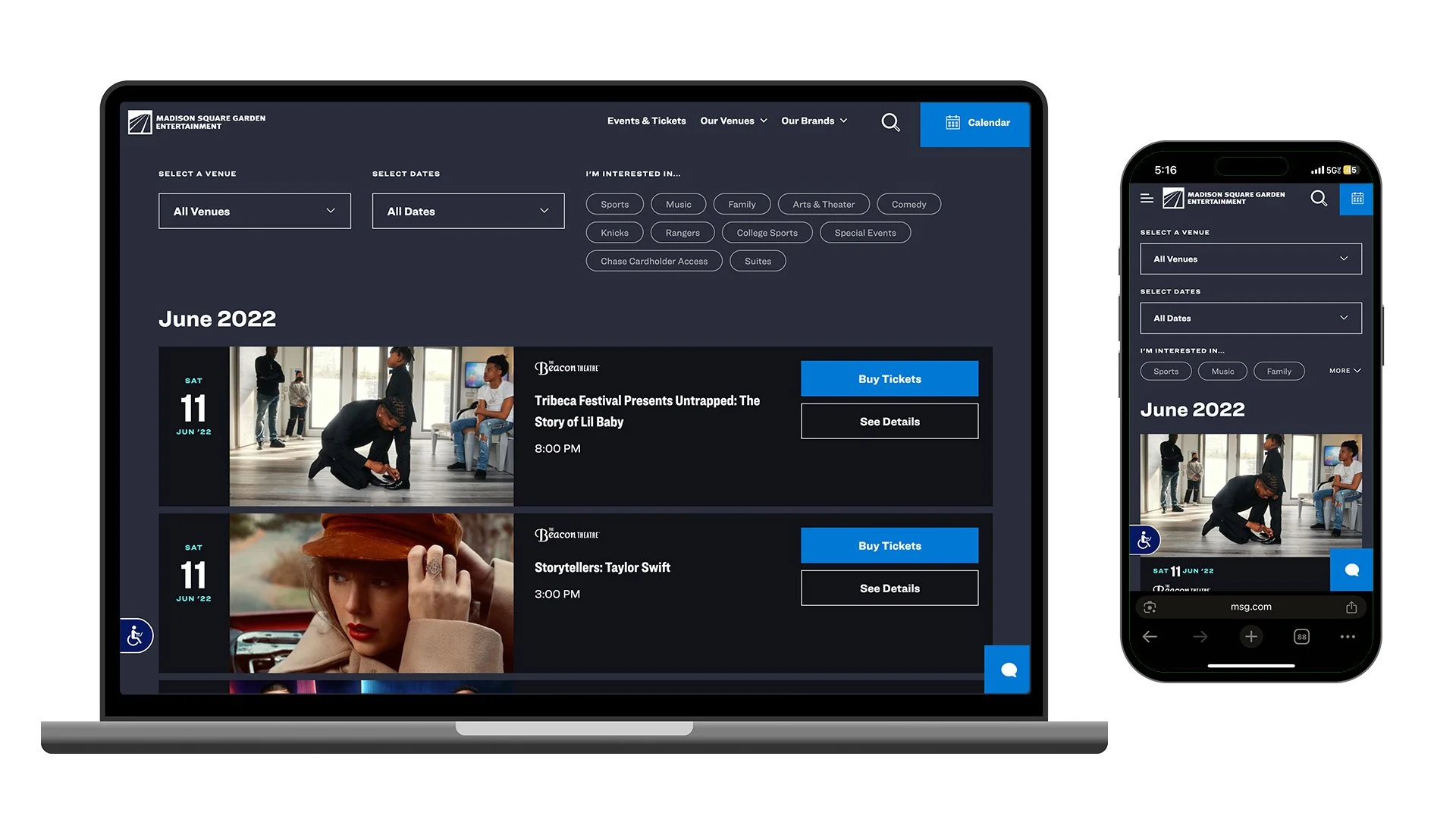
MSG.com Calendar page on desktop and mobile ca. 2022, before feature and interactivity enhancements.
The MSG Calendar page was single column page with rows of event listings, showcasing key art, venue logos, event titles, tour and supporting act information, event date and times and a button driving to Ticketmaster for transaction and another linking to each event’s detail page. The page previously included a simple sorting feature below the top nav that user could filter by genres or categories to refine event results.
Of the entire site, the calendar page maintained the most traffic due to the variety of journeys that would land a user there, be it through organic search, email or social marketing, direct ad promotion, etc. This page proved to have some of the most crucial opportunities for improvement to enhance retention, discovery, and ultimately click through for purchase.
Beginning with low-fidelity wireframes to propose page enhancements as part of fiscal planning, my team created layouts that represented various feature implementations across desktop, tablet and mobile viewports. Each of the key features we were aiming to enhance or create were driven by consumer insights in collaboration with our Data & Analytics team. We chose both fan-requested improvements as well as UI and interactive elements influenced by competitive sites such as Climate Pledge Arena, Crypto Arena, and UBS Arena. Our content manager and coordinators also reviewed SEO opportunities to ensure that this page was both highly discoverable and easy to navigate as part of the overall improvements geared for impact.
The key features we were focused on improving during this project included:
A completely redesigned top navigation and footer system with unique URLs per venue
Page header with SEO enhanced language, an event results counter, and pills that displayed the users current filter selections
A new Filter column for desktop and tablet and a drawer for mobile that included a calendar date range selector, event types and event venues
Enhanced UI to connect the existing styles across the site to the refreshed designs
A new View switcher to provide users multiple ways of displaying event listings
Day- and event-level flag indicators for each event to be used for both informational details (ie. TONIGHT, THIS WEEKEND) and marketing initiatives such as distressed inventory, sports theme nights and playoff games, device-free events, etc.
Multi-event scenarios for performances that might occur across several days (artist residencies such as Billy Joel) or within a single day (Christmas Spectacular starring The Radio City Rockettes)
A revised, three-tiered button system to help indicate CTA priority (transactional vs informational)
A limit to events displayed on initial page load, and a lazy-load refresh at the bottom for page speed and server call optimization
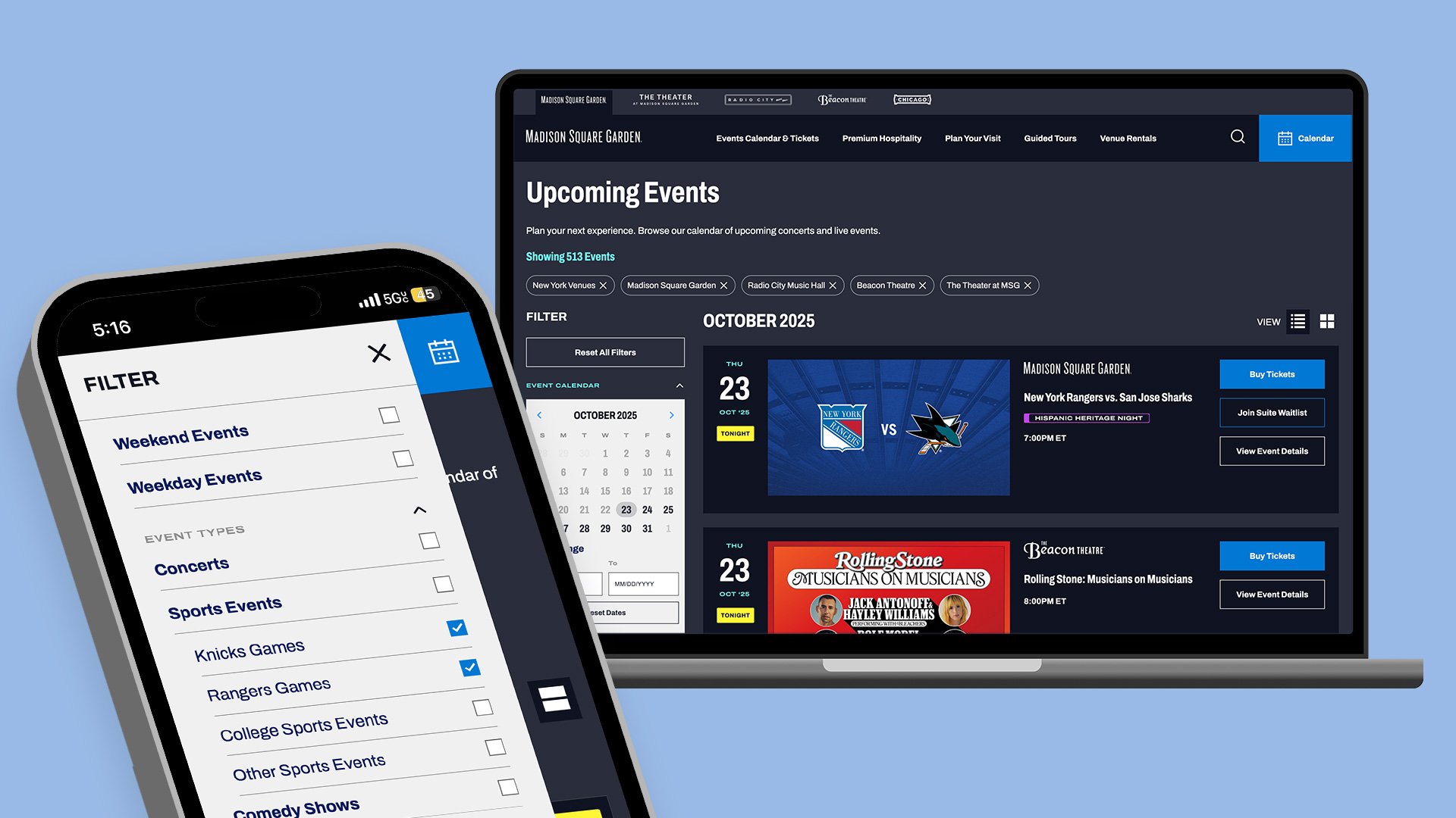
MSG.com Calendar page on desktop and mobile ca. 2025, after feature updates showcasing the new filter menu, events results counter, filter selections, day- and event-level flags, and enhanced button style system.
Once fiscal planning and features were approved by our marketing strategy stakeholders and executives, we ran an initial usability test with NPS to establish a baseline for the existing page. Our initial round of user research through the UserTesting platform saw pain points and edge cases that helped validate UI decisions and interactivity needed to improve the user experience.
Further rounds of user research and testing helped guide content priority decisions based on user interactivity by function and frequency. Validated by quantitative data through ContentSquare, we further arranged the filter column to prioritize each section according to live usage both pre- and post-launch.
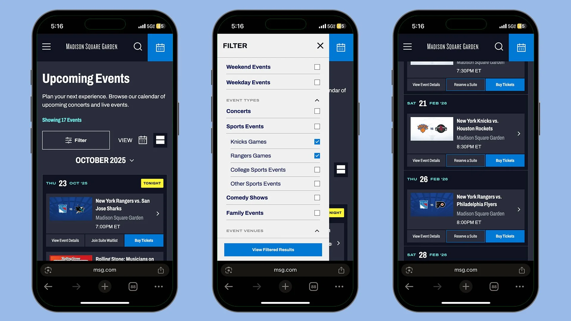
MSG.com Calendar page on mobile ca. 2025, after feature updates showcasing a condensed events list, the new filter menu, day- and event-level flags, and enhanced button style system.
As the MVP of our refreshed Calendar page was set to launch, leadership indicated they also wanted a slightly different way of browsing on mobile devices separate from what was initially approved. Given that this request was very late in the process of development (we were in User Acceptance Testing by this point), we offered several options to delay, pivot, or push other features in our roadmap to accommodate. A new mobile calendar view was added to the mix, showcasing the entirety of events for each month across venues dependent on the user’s geolocation, which became the default mobile experience you will see on msg.com/calendar today.
As a result, this project and other site enhancements contributed to an increase of site impressions by over 20% and contributed to $75M+ in digital ticket sales YOY.